Fostering Trustworthy Giving
Re-designing Teetayn’s reward-based donor experience to improve accessibility and build trust
UX/UI & Visual Design
2024
My Role
UX Design,
Visual Design
Tools
Figma
Timeline
1 week
Context
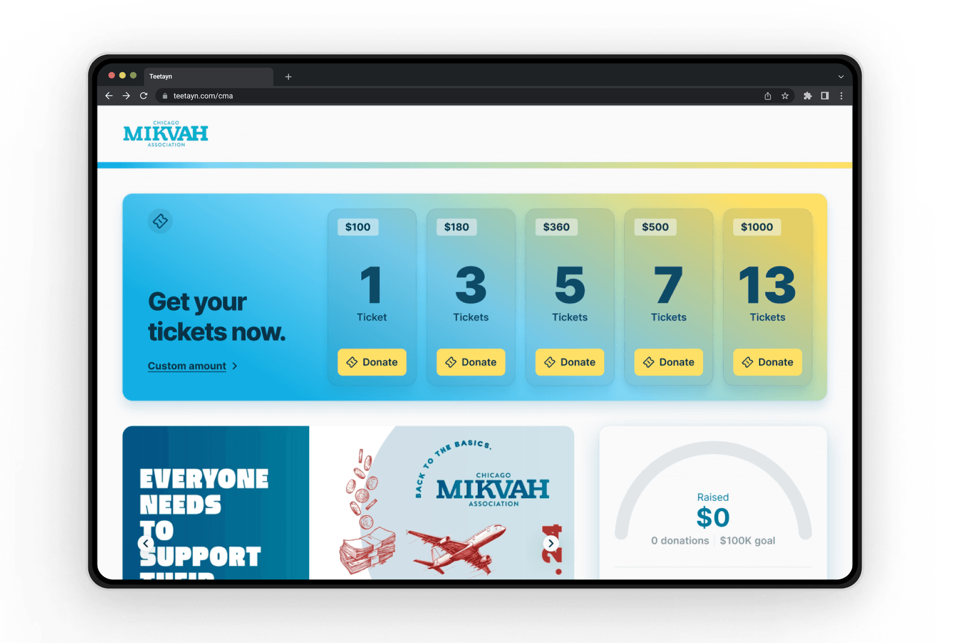
Teetayn is a online platform that helps charities leverage community-driven crowdfunding through custom built, flexible solutions. With a campaign launch fast-approaching, the interface appeared dated and lacked responsiveness, evoking a significant lack of trust and rendering the site unusable.
Their goal was to modernize visual design to establish legitimacy and emphasize the importance of tickets to increase donations.
As the solo designer for this project, I worked alongside a front-end developer to improve the reward-based donor experience by conducting research, implementing a scalable design system, and delivering responsive designs to improve overall usability.
Video
Before


Video
After
Problem
Distorted layouts and and disjointed information contributed to poor usability and conveyed a lack of legitimacy and trust that’s integral for crowdfunding services to succeed.
Limited Timeline
Timeline was limited to a total of seven working days, including development, with limited collaborative opportunities.
Development Constraints
Functional components were already developed, so the solution could not involve major changes to components.
Starting from scratch
Since no design files existed, the current interface needed to first be translated into editable files before making any changes.
Unclear User goals
Two perceived methods of donating were confusing.
Discovery
Defining success
What makes a good crowdfunding donor experience?
I analyzed well known competitors including Gofundme, Givebutter and Rallyup to determine key components of successful crowdfunding platforms.
Community
Users rely on social proof to evaluate security and intent from the community.
Flexibility
Raffle experiences are rigid and less prevalent. We must clearly accommodate users' needs to maximize donations.
Urgency
Deadline driven campaigns need to clearly convey how urgency effects user actions.
Challenge
Create a flexible and trustworthy reward-based donor experience that emphasized donations, community, a sense of urgency.
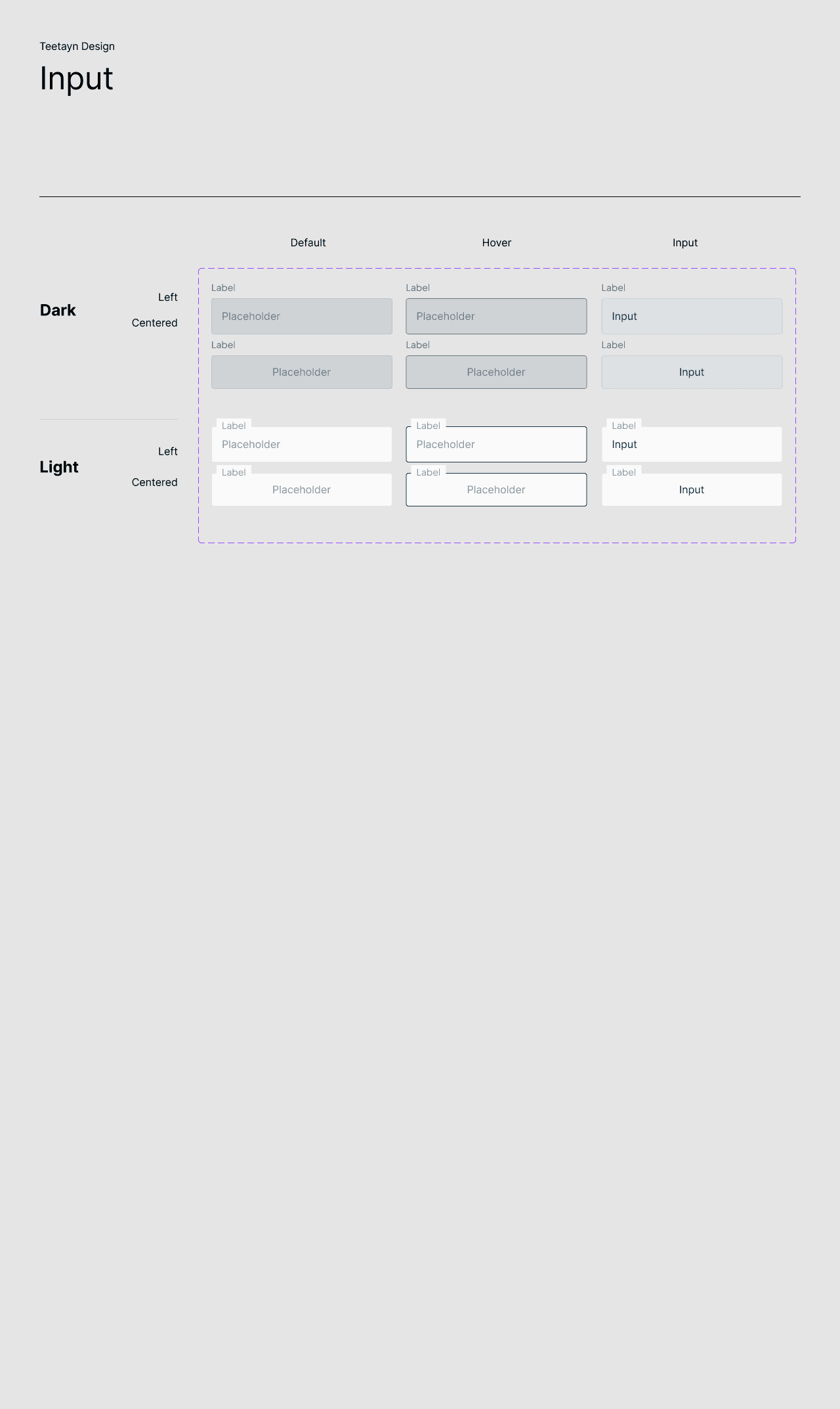
Design System
Ensuring efficiency and establishing structure
With a limited timeline, I prioritized establishing the design system so development could begin while design was ongoing
I first established brand colors and created a color scale that could be implemented strategically and ensure accessibility.
Defining atoms and components provided structure that helped us make efficient decisions and improved consistency and hierarchy throughout the interface.
Image
Fig 01. Design System

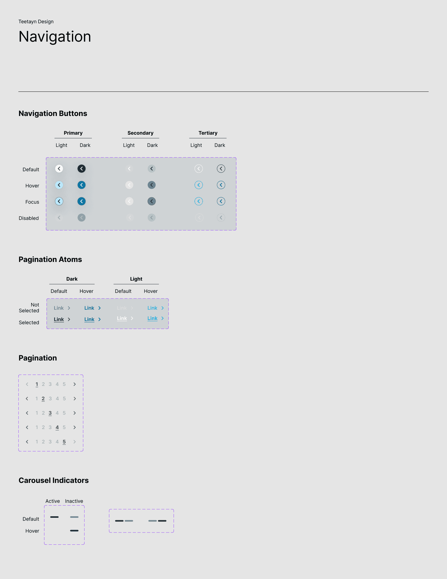
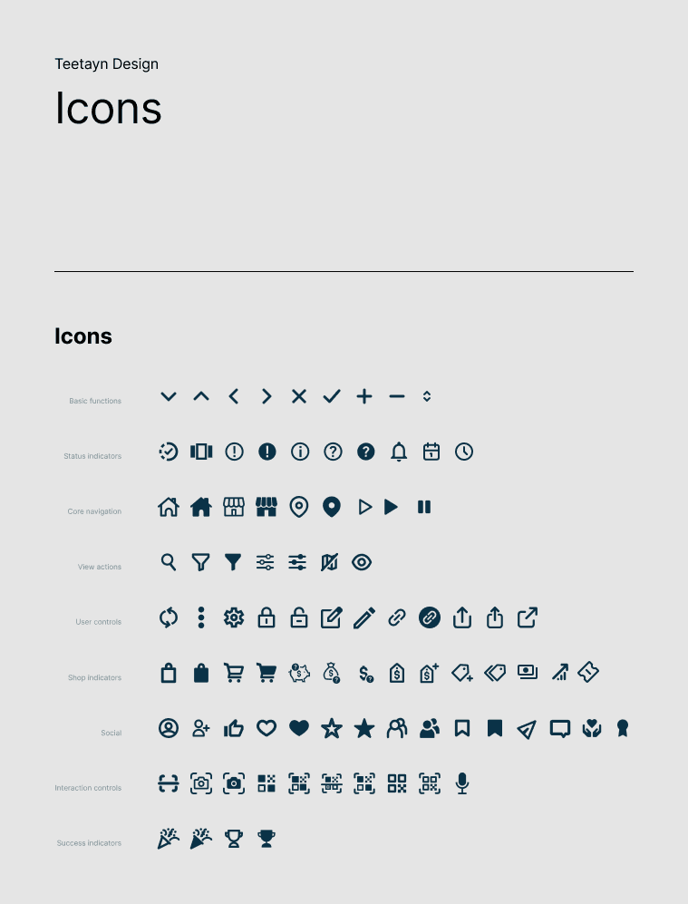
Image
Fig 02. Design System

Process
Improving visual design for a more user-friendly experience
The progress module was a clear starting point, with hierarchy and responsiveness obscuring pertinent campaign details
The existing layout incorporated the progress module above the fold, but scrolled out of view as users sought additional details. An unfamiliar flow of information and redundant, unnecessary styling confused users.
By incorporating scroll animations, the module could remain accessible while application of basic design principles helped to improve scannability and usability.
Image
Before


Image
After
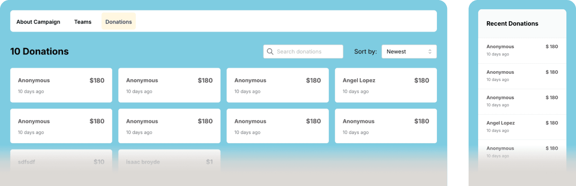
Streamlining donations
Recent donations were intended to encourage engagement, but lost relevance on mobile and featured redundant information. The donations tab was disjointed and prioritized viewing more donations over scannability.
I consolidated the two and made donations the default tab to preserve visibility. Vertical lists mimic feed patterns to convey passage of time while emphasized donation values and team avatars foster social proof and improve scannability.
Live donation notifications were considered, but ultimately rejected to mitigate unnecessary, non-dismissible distractions on high-traffic campaigns.
Image
Before
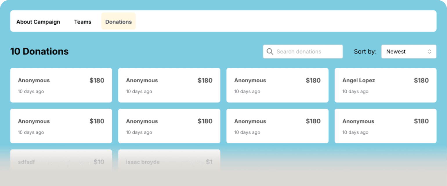
Donations Tab
Visually disjointed and lacking hierarchy
Layout makes content hard to compare and parse
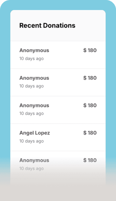
Recent Donations
Redundant
Distracting placement
Image
After

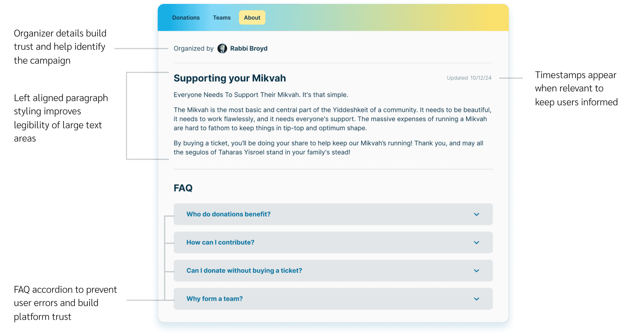
Enriching campaign overviews
The campaign overview contained a campaign story, but lacked any personalization and failed to address users' lingering questions that might prevent them from participating. Center aligned text made long stories cumbersome while a lack of context obscured organizer updates.
Organizer details and FAQs were added to promote trust and transparency while relevant metadata helps distinguish organizer updates.
Image
About

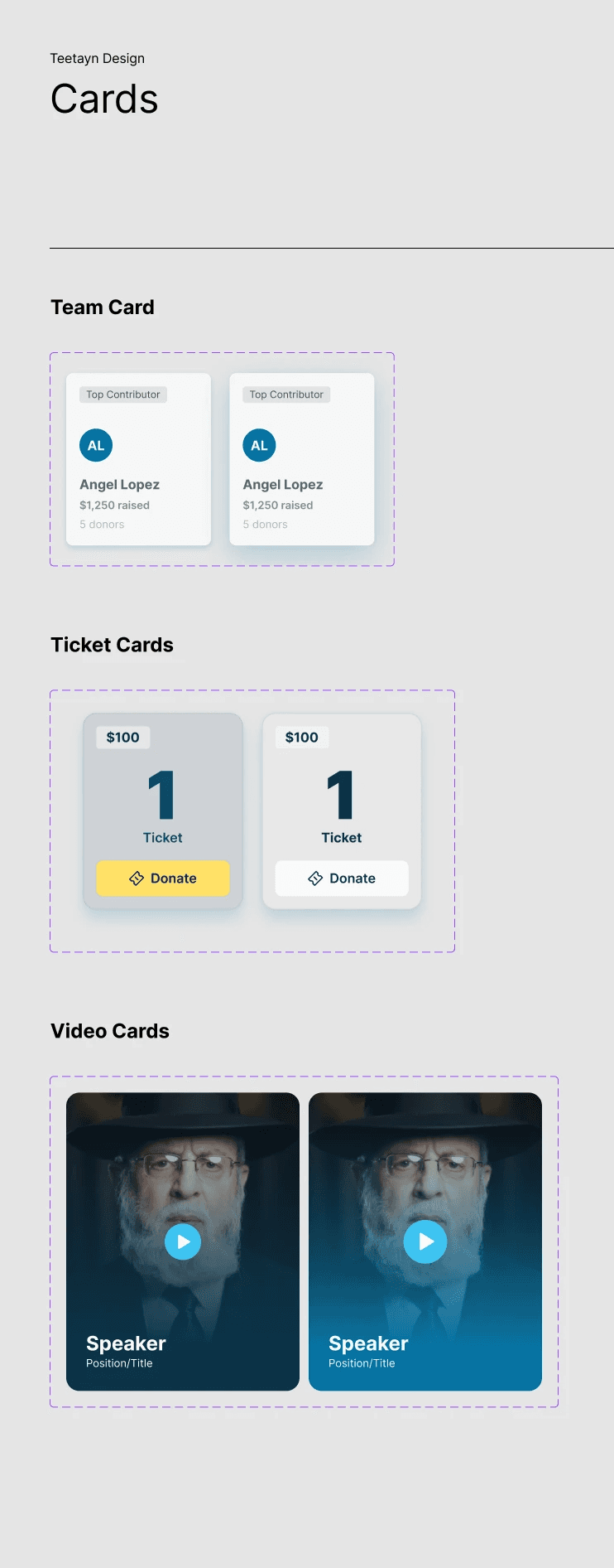
Top contributors and clear entry points
The initial Teams tab featured the same card view as Donations, causing confusion when toggling between the two. Cards were hard to parse with no visual identifiers or rankings to build engagement and a team could only be started within the checkout flow.
I added new team entry point and expanded team views on click to provide an additional layer of information. Team avatars and top contributor labels help users scan and differentiate participants quickly.
Video
Teams

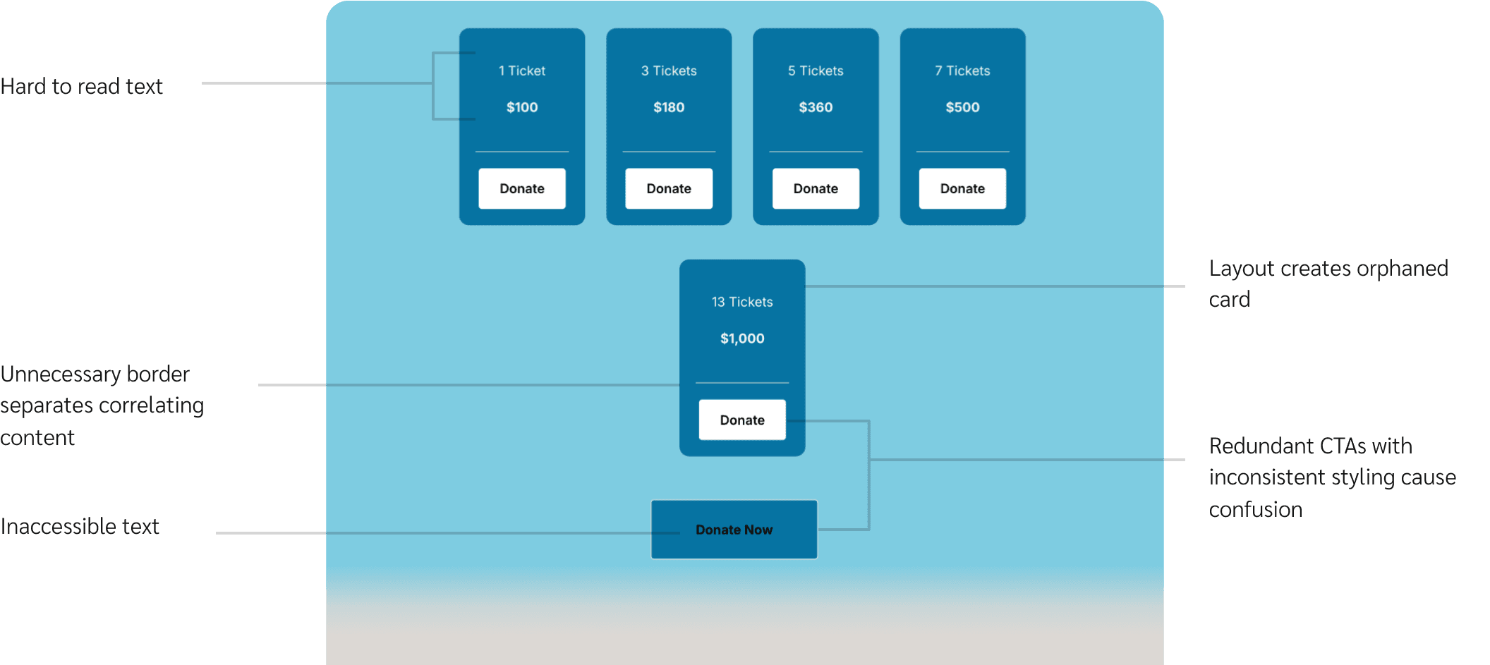
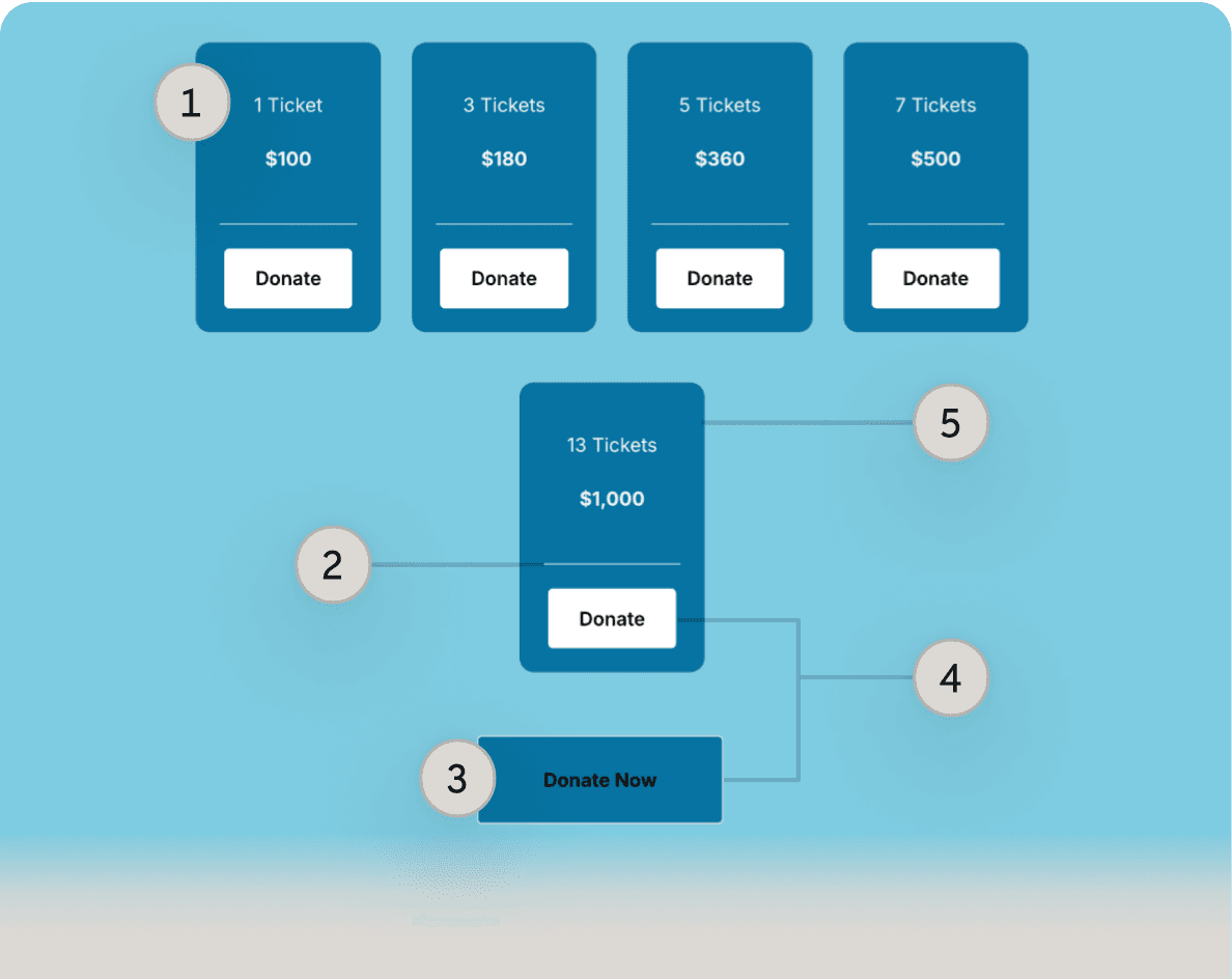
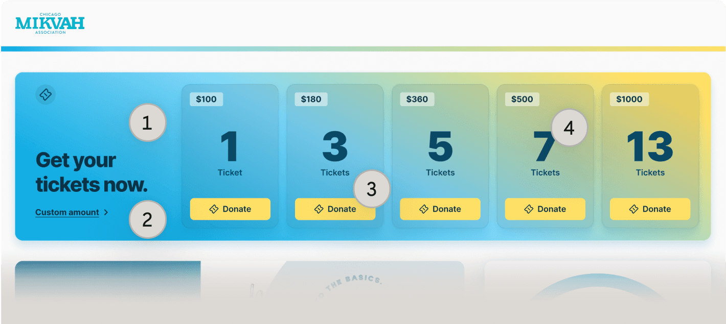
Improved ticket experience optimized for smaller screens
Initial emphasis was placed on cost with distracting CTAs and a redundant, inaccessible CTA that left users confused. Wrapping resulted in orphans that made options hard to parse.
Final designs are WCAG compliant featuring a secondary, contextual text button for users who prefer a custom donation value. The module becomes a swipable carousel on smaller screens to maintain consistency.
Image
Before
Image
After

Choosing the right layout
I explored various layouts to implement tickets and modernize overall aesthetic, collaborating with the client and developer to weigh the pros and cons of each.
Image
Layout
Sidebar
Proximity to progress module
Important actions below the fold
Low emphasis on tickets
Wrapping left column
Proximity to campaign prizes
Awkward wrapping on smaller screens
Hero with scroll effects
Modern, delightful experience
Higher development lift
Too much emphasis on platform brand
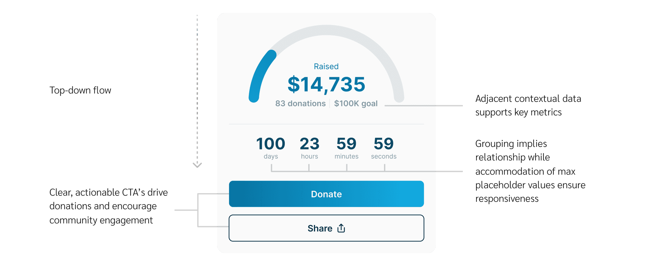
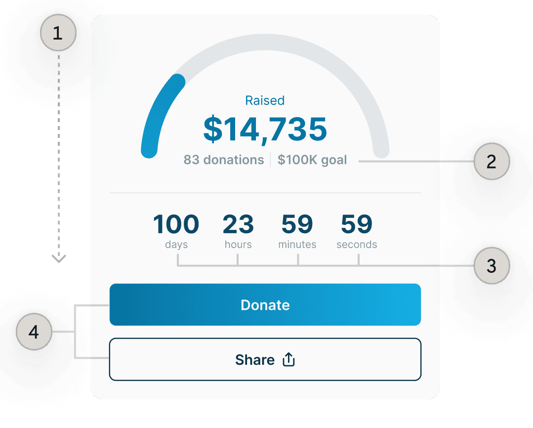
The Solution
Putting it all together
Optimized discoverability with simple, impactful visuals
Taking stakeholder feedback into account, the final solution features a full width ticket component at the top of desktop screens with a fixed donation button on mobile.
Glass effects and gradients modernize the interface with little development effort and maximum visual impact. The background gradient adds delight on scroll while static gradients draw attention to important components.
Video
Final Solution
Multiple entry points
Users can donate using pre-defined amounts or flexible, custom entries through multiple entry points within the experience.
Video
Video
Video
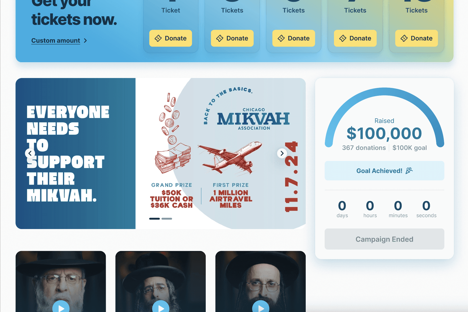
Addressing states to convey progression
State changes notify users of key campaign milestones like goals being achieved and campaigns ending.
Contextual metadata and contrasting campaign updates helps users distinguish information and fosters a trustworthy, engaging experience.
Video
Video
Campaign Updates
Results
Project status
While we successfully met our deadline, the client ultimately chose to implement designs through another platform.
Reflection
What I learned during this process
80% design system, 20% design in 0→1
Establishing the design system accounted for roughly 80% of the project timeline, but proved to be extremely beneficial working on a lean team with significant time constraints, eliminating back and forth conversations.
Design systems are an integral part of 0→1 product design in enabling rapid iteration, streamlining development, and infusing a cohesive visual language across the platform that could not have otherwise been achieved under these constraints.